Graphic Design I
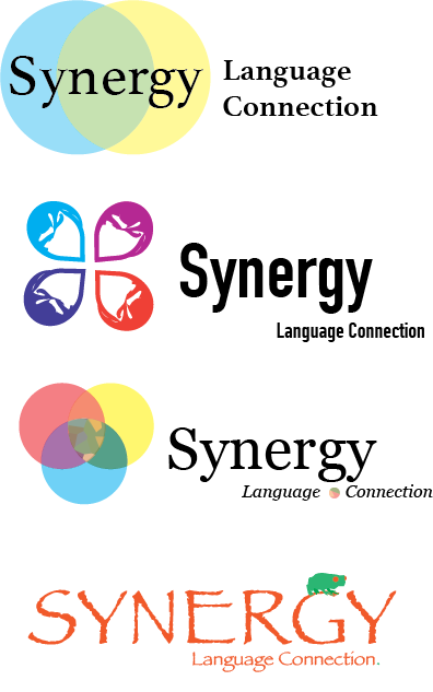
Designed by Raven Tenny for Synergy Language Connection
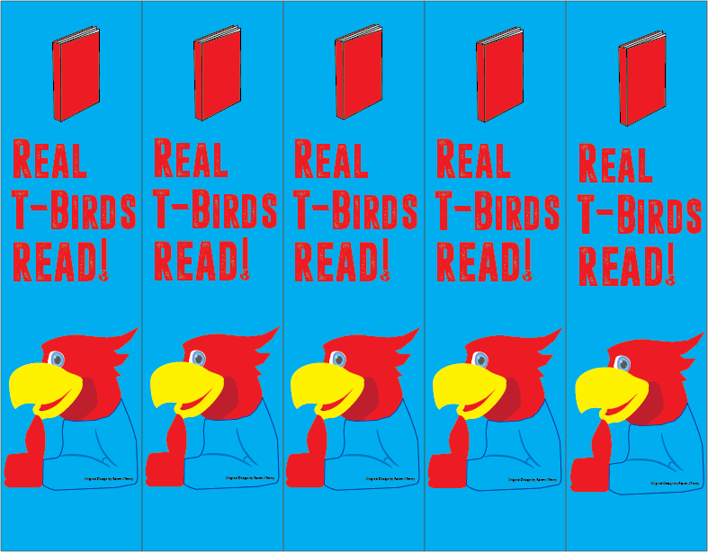
Bookmarks designed for the Shawnee Heights Book Club. (Above.)

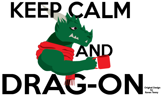
(Idea for scarf and mug partially inspired by the humor of my classmate Kurtis Allison.)

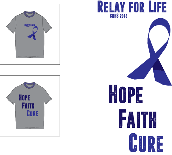
Design by Raven J Tenny for Relay For Life
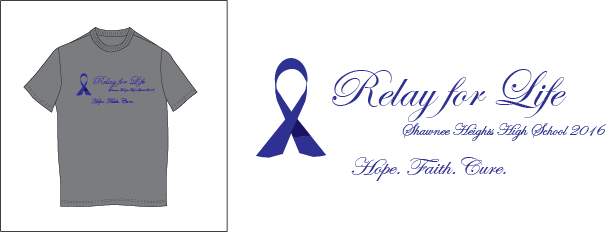
Design by Raven J Tenny for Relay for Life
Graphic Design Fundamentals

|
Grafitti Tag
In this assignment, I was required to create a three-dimensional graffiti tag of my last name (Tenny). I chose to base mine off of the classic NAMCO video game character Pacman. I drew 10 different thumbnails (see "sketchbook") of potential designs to use for this project, and explored a variety of color schemes. I had considered the triadic red-yellow-blue combo (which would have better suit the classic colors of Pacman), but I decided to go for the complementary combination of yellow and purple because ever since taking my Design class last year, I think it has become one of my favorite color schemes to work with. Purple and yellow also have kind of an "arcade-like" attribute to them. |
|
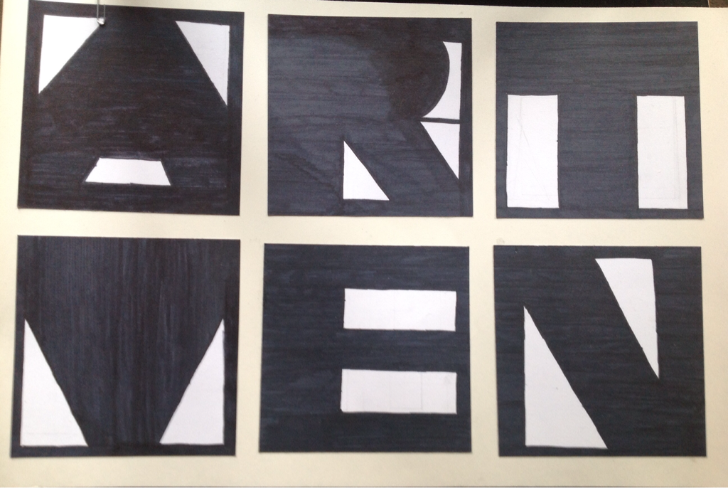
Figure-Ground Letters: ARTVEN (RAVEN T)
This assignment required us to utilize our knowledge of positive and negative space to create 6 boxes, each containing letters that fit some sort of theme. A lot of artistic freedom was given with this assignment. |
|
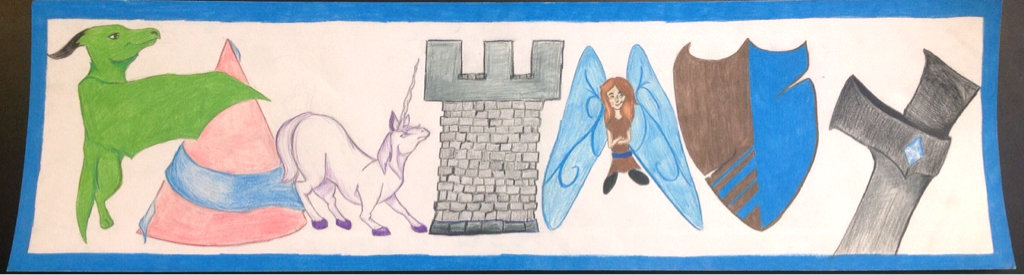
Word Illustration
The concept of the word illustration is to form a word out of pictures of objects that help define it. There were no restrictions concerning color for this assignment. My choice word was "FANTASY". The objects used to spell and define that word were (in order from left to right): a dragon for "F", a hennin (pointed conical hat, often worn by old-timey midieval princesses and noblewomen) for "A", a unicorn for "N", an archer's tower/castle column for "T", a fairy for the second "A", a shield for "S", and a sword hilt shapes the "Y". I also attempted to make a theme with the "True Blue" color throughout the piece. (The unicorn's eye is blue.) I used colored pencils only (Prismacolor 12 Pencil set). I had to do some seriously blending for the hennin, the fairy, or any shade of grey, but I would say the end result was worth it. I had a lot of fun with this project. |
|
|
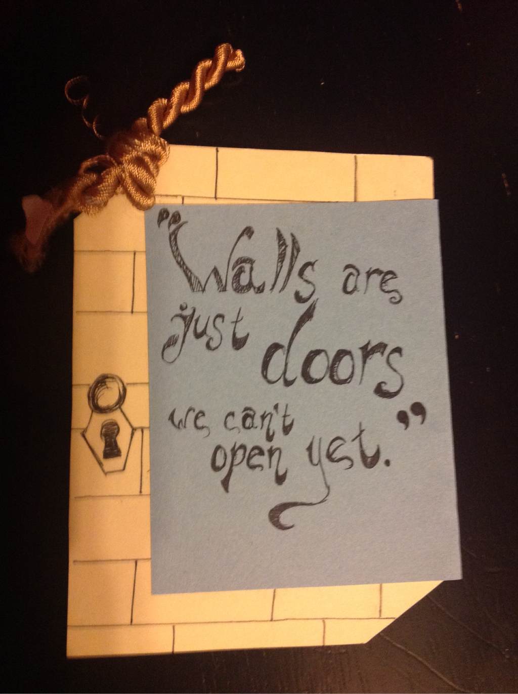
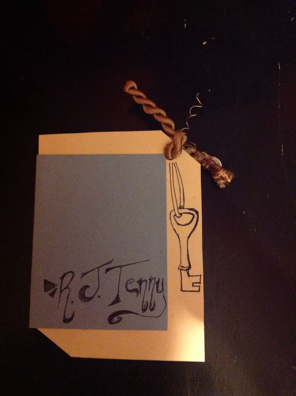
Bookmark
In this assignment, I was to design a bookmark. This bookmark was to contain a quote, poem, or saying, written in the art of beautiful handwriting-- aka Calligraphy. I chose to utilize my own original quote/saying, "Walls are just doors we can't open yet." The style of calligraphy was also an original design, based partially off of Chancery, but mostly off of my own fabulous handwriting ;). |
|
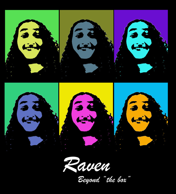
Me in Andy
We finally started working with computers! In this assignment, I explored the world of Photoshop as we studied the artistic style of Andy Warhol. The words "Beyond 'the box'" were placed in the bottom as a description of my personality. (It was intended as an exaggeration of the phrase "outside the box".) |
|
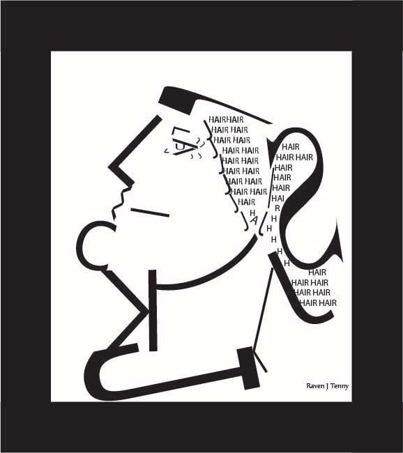
Typography Portrait
In this assignment we were required to build a portrait of a human face, hair, and shoulders out of only letters ( and a few other assorted keys). Thankfully, we were allowed to use different fonts, sizes, and rotations in the process. The letters I used in this project included J,K,C, J (of a different font), /, S, U, L, (, V, w. |

|
Career Poster: Animation
I was assigned to create an ad for a certain artistic career. I chose animation, since I am planning on becoming an animator in the future. I researched information such as the experience required, the usual business hours, and all that an animator could be doing in their work environment. The illustration I did by hand and scanned into my computer. I drew a tree that is halfway finalized, and with half still in its early mesh form (the part that gives it its outer shape in a sort of grid-like skeletal form, before they go over it in more detail.) |
|
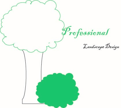
Logo: Professional (Treebush)
I was given a list of 10 words that described a fictitious company. With those 10 words we were supposed to determine what the company did, and as logo to represent it. My words were Landscape, $$ (a definition of my budget and limit of colors), Professional, Nature, Plants, Rocks, Organic, Design, Reliable, and Guaranteed. I decided that this company most likely worked with landscape design, and titled the company "Professional", since it was the #1 word on the list. |
|
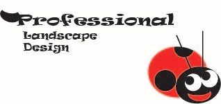
Logo: Professional (Ladybug)
I was given a list of 10 words that described a fictitious company. With those 10 words we were supposed to determine what the company did, and as logo to represent it. My words were Landscape, $$ (a definition of my budget and limit of colors), Professional, Nature, Plants, Rocks, Organic, Design, Reliable, and Guaranteed. I decided that this company most likely worked with landscape design, and titled the company "Professional", since it was the #1 word on the list. (The ladybug originally replaced the "e" in the company title, but Ms.Ayers thought it looked better this way.) |
|
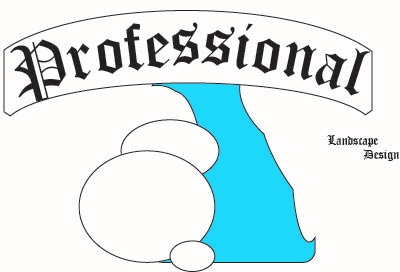
Logo:Professional (Bridgeway)
I was given a list of 10 words that described a fictitious company. With those 10 words we were supposed to determine what the company did, and as logo to represent it. My words were Landscape, $$ (a definition of my budget and limit of colors), Professional, Nature, Plants, Rocks, Organic, Design, Reliable, and Guaranteed. I decided that this company most likely worked with landscape design, and titled the company "Professional", since it was the #1 word on the list. (This one was supposed to be to be a bridge over a waterfall. Ms.Ayers thinks it looks more like a tree.) |

|
Professional Stationary
I created a stationary for my company centered around the ladybug logo. The stationary includes a letterhead, business card, and envelope. The business cards and letterhead are supposed to carry a leaf-like shape to them (The curved lines would be cut). I also came up with the slogan "Remarkably Green", which I consider to be rather clever, since this is a landscaping company (ergo it makes you think green), yet I used its complimentary color--red-- throughout the company's theme. |
