Design

Line Design
For this project, we were supposed to display the 5 different types of lines: Curved, Jagged, Horizontal, Vertical and Diagonal. With these various styles of lines, we sketched a pattern, design, or concept onto normal paper. We later took the most exciting parts of our sketch and redrew them onto drawing paper, rubber cemented the whole thing onto cardboard, cut the pieces apart, and rearranged them to show the final product that lies before you. Mine is meant to show the music behind nature.
Finished 6/28/2013
(Sorry, unfortunately I did not have the best camera handy...)

Tessellations
In this project, we began with drawing a triangle onto a smaller sheet of paper. We then began distorting it by taking certain parts out, and sticking them somewhere else. We cut out the shape, and traced the pattern across the page. If you flip it upside down, it should have the same pattern in yellow!
In this project, we began with drawing a triangle onto a smaller sheet of paper. We then began distorting it by taking certain parts out, and sticking them somewhere else. We cut out the shape, and traced the pattern across the page. If you flip it upside down, it should have the same pattern in yellow!
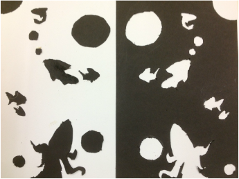
Positives and Negatives
In this assignment we were required to draw a design onto black paper. We then cut out the pattern and glued it onto one side of a white sheet of paper, the left over of the black sheet was then pasted onto the other side, creating a mirror effect. I used fish!
Finished 6/30/2013
In this assignment we were required to draw a design onto black paper. We then cut out the pattern and glued it onto one side of a white sheet of paper, the left over of the black sheet was then pasted onto the other side, creating a mirror effect. I used fish!
Finished 6/30/2013

Name-Line Project
For this assignment we were instructed to sketch four different shapes (Other sketches can be found under "sketchbook"). A shape included any one closed item that we could fit large writing inside of. We then wrote our names in bubble/box letters inside it, with the top and bottom of each letter reaching the top and bottom edges of the shape, and erased the places where they touched. I selected my Asian dragon sketch for my final project because it was the most unique and the most challenging of the four. Making it the most fun! I redrew the dragon across a bigger sheet of paper, and colored it with metallic colored pencils and gave it a fiery background with shades of black, maroon, red, red-orange, orange, yellow-orange, and yellow.
For this assignment we were instructed to sketch four different shapes (Other sketches can be found under "sketchbook"). A shape included any one closed item that we could fit large writing inside of. We then wrote our names in bubble/box letters inside it, with the top and bottom of each letter reaching the top and bottom edges of the shape, and erased the places where they touched. I selected my Asian dragon sketch for my final project because it was the most unique and the most challenging of the four. Making it the most fun! I redrew the dragon across a bigger sheet of paper, and colored it with metallic colored pencils and gave it a fiery background with shades of black, maroon, red, red-orange, orange, yellow-orange, and yellow.
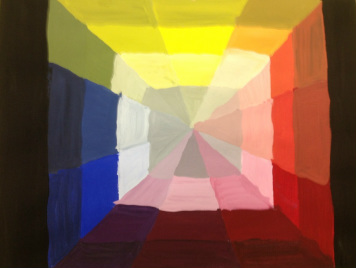
Color Wheel
My first painting project! Using only red, yellow, and blue (+black and white), I created a color wheel...er, square...thing. I began by drawing out the square and dissecting it into twelve separate rows, then splitting each row into four to include the shade, hue, tint, and tone of each color.
My first painting project! Using only red, yellow, and blue (+black and white), I created a color wheel...er, square...thing. I began by drawing out the square and dissecting it into twelve separate rows, then splitting each row into four to include the shade, hue, tint, and tone of each color.

Landscape: Achromatic
This project begins with printing off a unique photograph of a landscape you like. Landscapes solely include realistic pictures of both land and sky. The picture is then shaded thoroughly on the back (this can also be done the graphite paper in back), and the picture is traced over a sheet of paper. Then I painted it to fit a certain color scheme.
This one is achromatic. The only colors used in this piece are black, white, and gray.

Landscape: Monochromatic
This project begins with printing off a unique photograph of a landscape you like. Landscapes solely include realistic pictures of both land and sky. The picture is then shaded thoroughly on the back (this can also be done the graphite paper in back), and the picture is traced over a sheet of paper. Then I painted it to fit a certain color scheme.
This is a monochromatic scheme, meaning it is composed of only one color mixed with black, white, and gray. I chose green.

Landscape: Traidic
This project begins with printing off a unique photograph of a landscape you like. Landscapes solely include realistic pictures of both land and sky. The picture is then shaded thoroughly on the back (this can also be done the graphite paper in back), and the picture is traced over a sheet of paper. Then I painted it to fit a certain color scheme.
Behold the triadic scheme in this piece! The triadic color scheme uses three colors, all across from one another on the color-wheel. These include the primary colors (red, yellow, and blue) and the secondary colors (Orange, Purple, and Green). Black, white, and gray are mixed into colors to add the illusion of depth. I chose to use secondary colors because it seemed more unique, and I really like the colors orange and green.

Landscape: Complementary
This project begins with printing off a unique photograph of a landscape you like. Landscapes solely include realistic pictures of both land and sky. The picture is then shaded thoroughly on the back (this can also be done the graphite paper in back), and the picture is traced over a sheet of paper. Then I painted it to fit a certain color scheme.
This color scheme is complementary. It's composed of two colors on opposite sides of the color wheel (+black, white, and gray). (Ex: Red and Green, Blue and Orange, Yellow and Purple, Yellow-Orange and Blue-Violet.) I chose blue and orange.

Landscape: Analogous
This project begins with printing off a unique photograph of a landscape you like. Landscapes solely include realistic pictures of both land and sky. The picture is then shaded thoroughly on the back (this can also be done the graphite paper in back), and the picture is traced over a sheet of paper. Then I painted it to fit a certain color scheme.
The scheme on this last project is called Analogous. It's a commonly used scheme among artists where you paint with only three colors that are side-by-side on the color wheel(+black, white, or gray). (Ex: Red+ Red-Violet +Red-Orange, Blue+ Blue-Violet+ Violet, Yellow-Green+ Yellow+ Yellow-Orange, etc.) I chose Yellow, Yellow-Orange, and Orange because I realized I had neglected to use yellow so far, and that is my absolute favorite color!!! (Orange and Green are tied for second. :) )
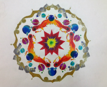
Radial Design: For this project I drew an overlapping design onto a "pie slice" shaped piece of paper. Then I thoroughly retraced and darkened all of the lines. I traced the design onto a 18x24 piece of paper, then flipped it over and did the same right next to it so the patterns line up. All open ends meet together. The shapes should mirror one another. I did this again (six times) all the way around a single point until it reached a full circle. Then I used colored pencils to blend the colors. Every single shape in this picture has at least two colors blended together in it. Most of them have more.
Pointillism/Stippling Project:

Visual Word:
In this project, an arrangement of letters portrays a word morphing into the shape of the object it represents. For example, I chose the word "DRAGON". "D" makes the head, "R" is the neck, "A" makes the dragon's folded wing, "G" creates it's leg, "O" makes the torso, and and "N" finishes the tail. I colored each letter a different color in hopes they would be easier to identify, rather than coloring them all one color, or coloring it like an actual dragon.
In this project, an arrangement of letters portrays a word morphing into the shape of the object it represents. For example, I chose the word "DRAGON". "D" makes the head, "R" is the neck, "A" makes the dragon's folded wing, "G" creates it's leg, "O" makes the torso, and and "N" finishes the tail. I colored each letter a different color in hopes they would be easier to identify, rather than coloring them all one color, or coloring it like an actual dragon.
1 pt Perspective:
Working on looking at things from a three-dimensional point of view. 1 Point Perspective is used when the object's face is towards you. Everything draws back to a vanishing point, just like the way you see. When things are farther away, the look smaller, and come closer together. That's what I tried to show in this assignment through rows of simple shapes. I also hope to display the color wheel throughout it as well.
Working on looking at things from a three-dimensional point of view. 1 Point Perspective is used when the object's face is towards you. Everything draws back to a vanishing point, just like the way you see. When things are farther away, the look smaller, and come closer together. That's what I tried to show in this assignment through rows of simple shapes. I also hope to display the color wheel throughout it as well.
2 Pt Letter:
2 Point Perspective is used when the edge of the shape is facing you. To try this project, we used our names. When drawing in 2 pt perspective, one also has to take into account the line of sight, and what parts of the shape will be above or below the beholder's view. There are also two vanishing points, making things in between them seem generally closer to you.
2 Point Perspective is used when the edge of the shape is facing you. To try this project, we used our names. When drawing in 2 pt perspective, one also has to take into account the line of sight, and what parts of the shape will be above or below the beholder's view. There are also two vanishing points, making things in between them seem generally closer to you.
